Aptos; Basic Kerning Text; The Grid
NOTE: I totally forgot to do the “AI summary” thing yesterday, but did not do so today.
This installment of Typography Tuesday gives a nod to Microsoft Office’s new default font, gives you a link to an excellent kerning aid, and showcases an online tool for nailing down a decent typographic grid.
TL;DR
Today, I used Perplexity.ai with its “Writing Focus” enabled to generate the bulleted summary. Prompt and output (which I used without editing) are here.
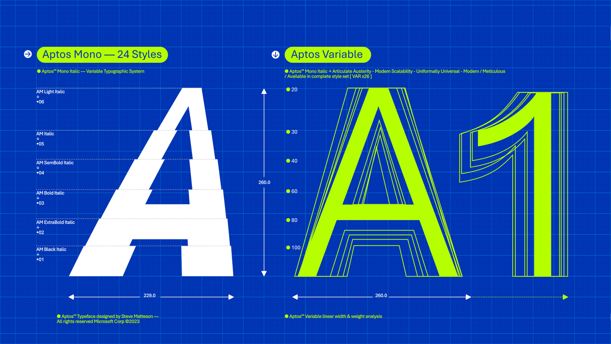
Aptos: Microsoft’s new default font, Aptos, replaces Calibri and is inspired by mid-20th-century Swiss typography. It was chosen after user feedback from five commissioned fonts. Learn more about Aptos here.
Basic Kerning Text: Alessandro Segalini, a communication designer specializing in typography, provides a comprehensive contact sheet with an extensive set of kerning pairs for evaluating fonts in your projects.
The Grid: Gridlover is a web-based tool that simplifies the process of creating a typographic system with modular scale and vertical rhythm. It helps maintain consistency, enhance readability, and adapt to different screen sizes. Try Gridlover here.
Aptos
I was waiting until Aptos appeared in my /Applications/Microsoft Word.app/Contents/Resources/DFonts folder to discuss the soon-to-be telltale sign that you don’t care about documents you publish. It has appeared (likely a bit ago; I fire up Word infrequently — mostly just to preview Quarto renders). So, we shall dig into Microsoft’s new default document font.
Aptos replaces the long-standing Calibri font. It’s a sans-serif typeface inspired by mid-20th-century Swiss typography, characterized by clean lines, open counters, and balanced proportions. Designed by Steve Matteson, the creator of Segoe, Aptos is optimized for screen viewing and offers improved readability at various sizes.
Microsoft began its search for a new default font in 2021, commissioning five new fonts: Bierstadt (later renamed Aptos), Grandview, Seaford, Skeena, and Tenorite. After gathering feedback from users, Aptos emerged as the favorite and was chosen as the new default font for Microsoft Office.
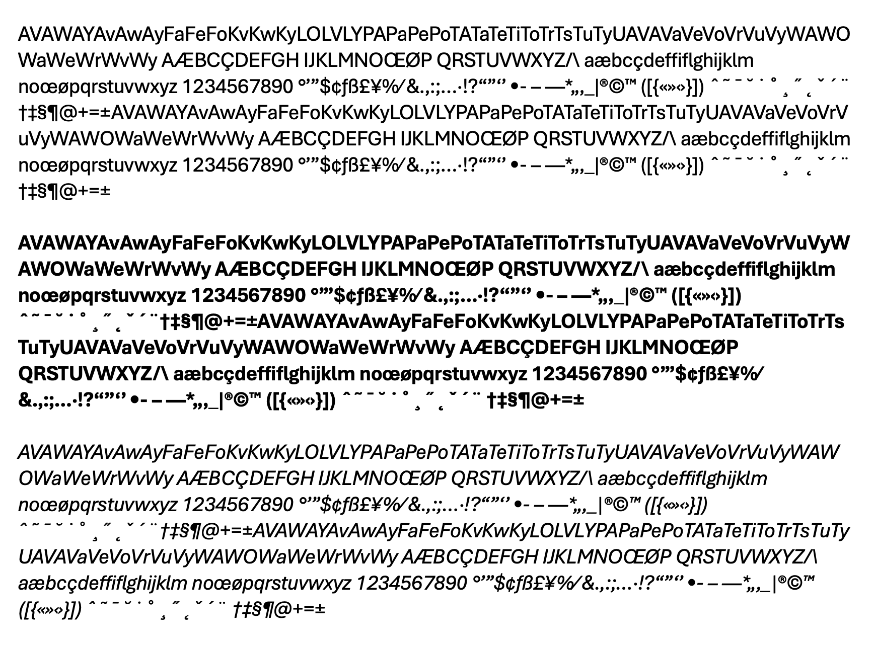
The text in the following image may be jibberish in terms of content. But, I created this sample to show off Aptos’ kerning pairs (that set of text is a good trial to see if the default kerning table of a given typeface is up to snuff). It’s…not bad.
Microsoft’s license for this typeface presently prohibits it from being redistributed. This means that a ZIP archive of it with an easily guessable name is totally not temporarily in a dl folder of a site with a familiar, short domain name to Drop readers.
Just like Calibri, this new font will be lazily overused, at least by Microsoft 365 folks.
Basic Kerning Text

I used a subset of common kerning pairs in the sample in the first section, but they are far from the only character set combos that one should use when discerning how well a font has been put together. Alessandro Segalini, a communication designer who specializes in typography, has a spiffy contact sheet with a much more extensive set that you should 100% save for your own project work, especially when you’re picking a new font or two to work with.
While you’re at Alessandro’s site, you may want to poke around a bit, as there are many gems, such as this one, which details how Segalini designed his Hemingway typeface (which you see in the section header, and can be purchased from here).
The Grid
The Grid.
A digital frontier.
I tried to picture clusters of information as they moved through the computer.
What did they look like? Ships? Motorcycles?
Were the circuits like freeways?
I kept dreaming of a world I thought I’d never see.
And then one day, I got in.
While I’d like nothing more than to do a full issue on Tron, I’ll just beg forgiveness for tossing in a quote that has nothing to do with the topic of this section. I just couldn’t resist.
As all Drop readers know, typography plays a crucial role in creating a visually appealing and human-friendly experience for our content. One of the key aspects of typography is the use of grids to establish a consistent and harmonious layout.
CSS typography grids help maintain vertical rhythm and ensure that text elements are aligned and organized in a visually pleasing manner. This is where Gridlover comes in, a web-based tool that simplifies the process of creating a typographic system with modular scale and said vertical rhythm.
By adjusting the font size, line height, and scale factor sliders, you can watch the typography “dance” and ultimately create a harmonious layout. The tool is designed to be intuitive and easy to use, making it an excellent resource for designers and developers alike.
A well-designed CSS typography grid provides numerous benefits:
grids help organize text elements and maintain consistency throughout a composition. This makes it easier for users to comprehend and interact with the content.
a well-structured grid enhances readability by ensuring that text elements are aligned and spaced appropriately.
grids contribute to the overall aesthetic of a design, creating a sense of coherence and regularity.
CSS grids can be easily adapted to different screen sizes and devices, ensuring a consistent experience across various platforms.
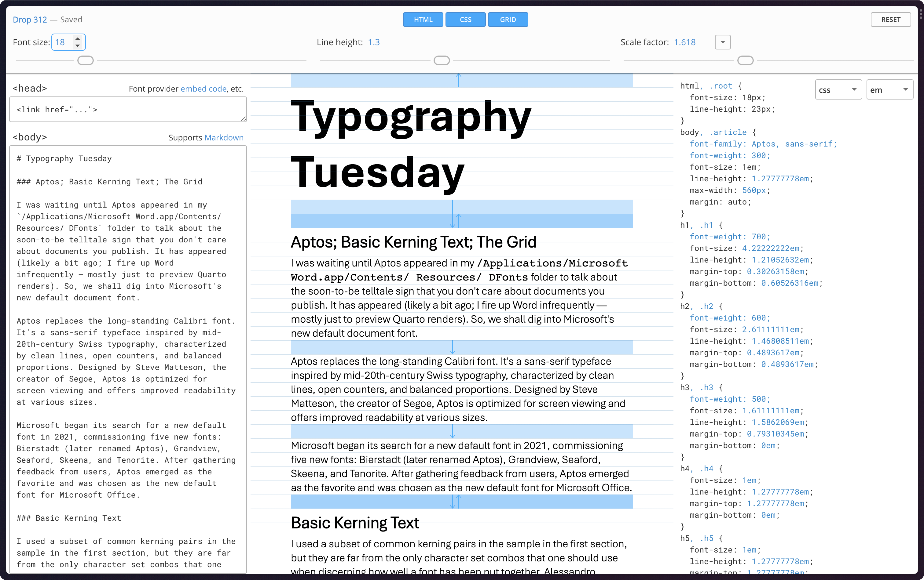
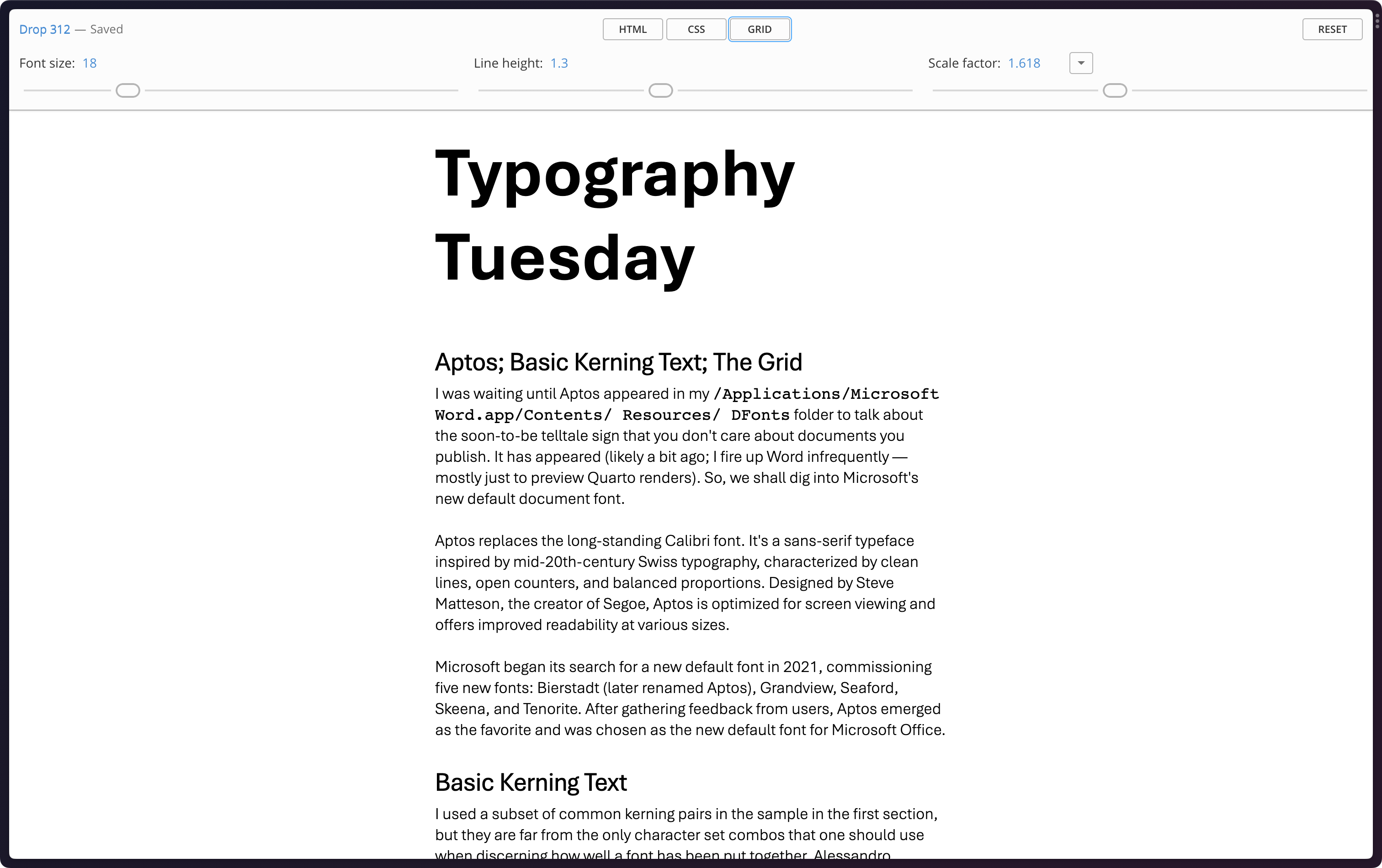
The section header contains a portion of the Markdown of this post in the Gridlover tool, and the following image is the results. Keen eyes will note the use of the Aptos font, too.
I sometimes struggle with CSS grids, and this is and has been a very helpful tool.
FIN
FWIW: a certain thing mentioned in the Drop, today, that totally does not exist, possibly expires in about a week. ☮

Leave a comment