Let’s Plot; Laws of UX; Logo Scale
Yes, I 100% did make up an alliterative tagline theme to enable me to shoehorn in three entirely different topics, today. But, I’ve been meaning to get each of these in and decided that perfect was indeed the enemy of good enough.
Whether you like decent charts, ensuring what you create is received well, or like non-skeezy AI, there should be items of interest to all.
Let’s Plot
I am increasingly “stuck” in Python-land contexts that do not easily lend themselves to the sanity of a temporary reliance on R’s {reticulate} package. Sometimes, said contexts also do not make it easy to rely on the ability to shunt data out of the Python processing for use with {ggplot2}. While there are plenty of plotting libraries for Python, I’m not really a fan of any of them.
A while ago, there were a few attempts at having a ggplot2-esque idiom for plotting in Python. Some still exist, but they all were lacking in some way. Thankfully, the fine folks at JetBrains have come to my (and your) rescue.
Let’s Plot (GH) is an open-source plotting library developed by JetBrains for Python and Kotlin, designed to provide a bridge between R (ggplot2) and Python data visualization. Inspired by the ggplot2 library for R, Let’s Plot offers a familiar and spiffy way to create high-quality visualizations using the Grammar of Graphics principles.
A sampling of the main features include:
customizable tooltips: You can customize the content, values formatting, and appearance of tooltips.
wide range of geoms: Let’s Plot supports numerous ggplot2 geoms, making it easy to create various types of plots.
geospatial support: The library offers elegant geospatial plotting capabilities, allowing users to create interactive maps and visualize geospatial data.
interactive visualizations: Let’s Plot enables the creation of interactive visualizations with just a few lines of code, setting it apart from other Python libraries like Matplotlib and Seaborn.
Let’s Plot can be particularly helpful for R users transitioning to Python or working in both languages. The library’s ggplot2-like API makes it easy for R users to adapt to Python while providing Python users with a familiar way to create visualizations. This allows data scientists and analysts to leverage the strengths of both languages and create more versatile, high-quality visualizations.
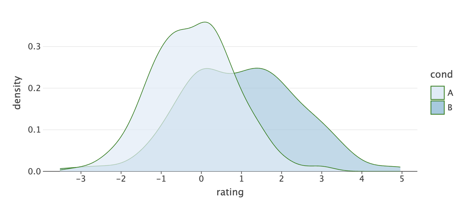
Here’s a simple example (stolen from their docs) of how to create a density plot using the Let’s Plot library:
import numpy as np
from lets_plot import *

LetsPlot.setup_html()

np.random.seed(12)
data = dict(
  cond=np.repeat(['A', 'B'], 200),
  rating=np.concatenate((np.random.normal(0, 1, 200), np.random.normal(1, 1.5, 200)))
)

ggplot(data, aes(x='rating', fill='cond')) + \
  ggsize(700, 300) + \
  geom_density(color='dark_green', alpha=.7) + \
  scale_fill_brewer(type='seq') + \
  theme(panel_grid_major_x='blank')
The section header is static output from one run of that code, and I tossed an example of how to use Let’s Plot in a Quarto document for y’all.
Hopefully, we’ll all start seeing nicer plots coming from the Python users out there. (Hey, a girl can dream.)
Laws of UX

Please read this comment before reading this section/hitting that site.
We haven’t really dug into “design” in a while, so I felt compelled to drop a recent resource I came across to start the week off right.
Laws of UX is a collection of 21 (as of today) best practices that designers can consider when building user interfaces. Here’s the pitch in their own words:
As humans, we have an underlying “blueprint” for how we perceive and process the world around us, and the study of psychology helps us decipher this blueprint. Designers can use this knowledge to build more intuitive, human-centered products and experiences. Instead of forcing users to adapt to the design of a product or experience, we can use some key principles from psychology as a guide for designing in a way that is adapted to people.
The Laws of UX site seeks to make complex psychology heuristics accessible to more designers through an interactive resource that collects those that are relevant to user experience design and presents them in a visually engaging way. It was created by Jon Yablonski.
Here’s what Jon covers:
Aesthetic-Usability Effect: Users often perceive aesthetically pleasing design as design that’s more usable.
Doherty Threshold: Productivity soars when a computer and its users interact at a pace (<400ms) that ensures that neither has to wait on the other.
Fitts’s Law: The time to acquire a target is a function of the distance to and size of the target.
Goal-Gradient Effect: The tendency to approach a goal increases with proximity to the goal.
Hick’s Law: The time it takes to make a decision increases with the number and complexity of choices.
Jakob’s Law: Users spend most of their time on other sites. This means that users prefer your site to work the same way as all the other sites they already know.
Law of Common Region: Elements tend to be perceived into groups if they are sharing an area with a clearly defined boundary.
Law of Proximity: Objects that are near, or proximate to each other, tend to be grouped together.
Law of Prägnanz: People will perceive and interpret ambiguous or complex images as the simplest form possible because it is the interpretation that requires the least cognitive effort of us.
Law of Similarity: The human eye tends to perceive similar elements in a design as a complete picture, shape, or group, even if those elements are separated.
Law of Uniform Connectedness: Elements that are visually connected are perceived as more related than elements with no connection.
Miller’s Law: The average person can only keep 7 (plus or minus 2) items in their working memory.
Occam’s Razor: Among competing hypotheses that predict equally well, the one with the fewest assumptions should be selected.
Pareto Principle: The Pareto principle states that, for many events, roughly 80% of the effects come from 20% of the causes.
Parkinson’s Law: Any task will inflate until all the available time is spent.
Peak-End Rule: People judge an experience largely based on how they felt at its peak and at its end, rather than the total sum or average of every moment of the experience.
Postel’s Law: Be liberal in what you accept, and conservative in what you send.
Serial Position Effect: Users have a propensity to best remember the first and last items in a series.
Tesler’s Law: Tesler’s Law, also known as The Law of Conservation of Complexity, states that for any system there is a certain amount of complexity which cannot be reduced.
Von Restorff Effect: The Von Restorff effect, also known as The Isolation Effect, predicts that when multiple similar objects are present, the one that differs from the rest is most likely to be remembered.
Zeigarnik Effect: People remember uncompleted or interrupted tasks better than completed tasks.
As I’ve noted in previous Drops, we all — in some way — create human experiences (I dislike the word “user” in the official acronym is “UX”). Learning as much as we can about designing things we create in a way that enables our fellow humans to experience them better means our messages have a higher likelihood of getting through.
It’s a wonderful resource to learn from and keep around as a reference.
Logo Scale

LogoScale is a free and open-source AI model that can upscale low-resolution logos to create higher resolution raster images. These higher resolution images can then be used in vector tracing software to generate vector logos that are close approximations of the original vector logos, which can be useful when the original vector logo files are lost. The model itself was trained on logos scraped from Wikimedia to upscale low-resolution logos regardless of complexity, and is compatible with all ESRGAN tools.
The site provides the trained model weights for free download under a fairly permissive license allowing for both commercial and non-commercial use, and the author hopes the model can help fill the world with more vector logos.
FIN
I hope y’all have (or, had) an astoundingly outstanding Monday! ☮

Leave a comment