Elstob; Commit; Dank
We might as well make Typography Tuesday a permanent fixture of the Drop, since y’all do seem to like it and there is an endless supply of typography topics to talk about.
Today is 100% focused on individual typefaces.
Elstob

Elstob is a modern variable typeface inspired by the Double Pica typeface — this is a digital adaptation of it — created by Bishop John Fell in the 17th century. While it is specifically designed for medievalists. It is named after Elizabeth Elstob, an 18th-century Anglo-Saxon scholar, and includes all Unicode characters, inclusive of the complete Unicode Runic range and International Phonetic Alphabet characters.
The Double Pica has a pretty cool history. It was used by the Oxford University Press in the late 17th and early 18th centuries, and its creation marked a significant historical moment in typography. John Fell, the aforementioned bishop, was an English churchman and influential academic of the 17th century. Like myself and many readers, he was collector of typefaces. Let’s remember, for a second, that said “collecting” was a physical meatspace activity, back in the day. Fell literally had a massive collections of sorts. Gosh we have it so easy today.
Fell aimed to make England self-reliant for typefaces, leading to the creation of the Double Pica. Cut by Peter de Walpergen, the Double Pica was among the first ‘Old Styles1‘ cast in England. It acted as a crucial link between the Dutch Old Styles of Kis, Van Dijck, and Dirck Voskens (who Kis studied under) in the 17th century, and the English Old Styles of William Caslon in the 18th century. Its use by the Oxford University Press significantly influenced the visual character of their publications. Much like modern use of fonts, a unique visual character helps/helped with “brand identification”. But, font uniqueness was even more important in those early days, since it assisted in preventing outright — what we would call today — “intellectual property theft”. Publishers would commission custom typefaces, and print in only those typefaces, so they and readers would know if some passage in another book, journal, etc. was stolen.
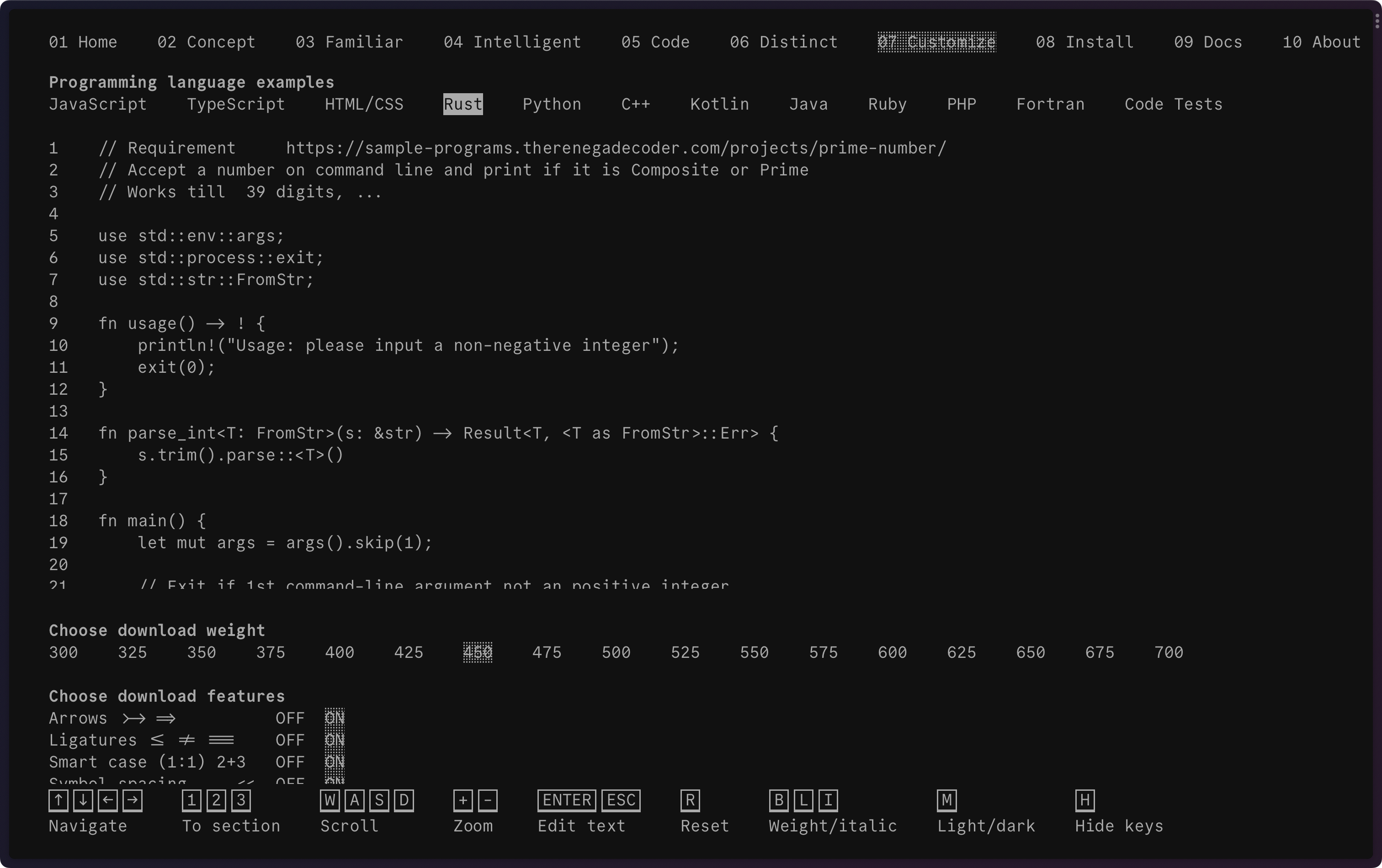
Going back to the future, Elstob is distinguished by its variable nature. As noted a few times in previous Drops, variable fonts can do the work of multiple conventional fonts by varying different aspects of the characters’ shapes. Elstob offers weights ranging from ExtraLight to ExtraBold, optical sizes from “Fine Print” (circa 6 points) to “Display” (circa 18 points or greater), and a grade axis (1-500). This versatility makes it especially suitable for web use, as a single file can replace multiple conventional fonts, resulting in faster loading times.
In fact, you get to play with all those variable features right on the linked page! And, you don’t just get the single (well, dual, since there is one for italic and non-italic) TTF! There’s a whole repo to explore how to build this font. For Linux users, packages even exist for Debian, Arch Linux, Parrot, and others.
Commit
(This one kind of made the socmed rounds last week, but it’s still worth a mention!)
Commit Mono is a project by Eigil Nikolajsen. It aims to be an anonymous and neutral coding font focused on creating a better reading experience. Eigil’s viewpoint is that an effective [coding] font is the one you don’t notice. In his own words, that means no super high x-height, no geometric construction, and no eye-catching design and no confusing ligatures. Commit Mono is, therefore, quite aligned with the Super Normal Manifesto.
While the emphasis may be on “normal”, that does not mean this typeface is “boring”. There are many aspects of the font that show an uncanny attention to detail. One of these is smart kerning, which you can play with in section four of Eigil’s site. Similarly, since this is a font meant for coders, great care has been paid to specific glyphs (see section five on the site). Eigil also has some recommendations for font weights when it comes to dark/light mode.
You can even customize the font (all the work is done in-browser, too) before downloading.
The site is a joy to dive into. Definitely do not just zip through it.
When you are done, make sure you check out some of Eigil’s other typefaces.
Dank

We’ll make today all about individual typefaces and toss in another coding font for good measure.
Dank Mono is “a coding typeface for aesthetes” designed by Phil Pluckthun. Unlike most of the fonts I toss into the Drop, this one is not free, but an individual license is just around $30.00 USD, so it’s not crazy expensive either.
Dank comes with batteries included, including ligatures and italic style.
The full character set includes Latin uppercase and lowercase letters, all modifiers, and diacritics covering most European languages. Additionally, it covers an exhaustive list of math symbols, the basic Greek glyphs, some terminal glyphs (e.g., Unicode block symbols, shades, circles, arrows, and Powerline symbols).
The section header has sample glyphs.
I grabbed a copy and wrote this section of today’s Drop (in VS Code, as usual) using it vs. my daily driver (Comic Code Ligatures, another non-free font). For me, it doesn’t work as a Markdown editing font (it just doesn’t “feel right” to me in that context). I also tried it on a few projects in various programming languages, and it most certainly works well in that context. We’ll see how it holds up as my WezTerm console font for a few days.
FIN
If you like Elstob/Double Pica, check out more of Fell’s fonts on Google Fonts. ☮
(this was a bit too wonky to include in situ) “Old Style” fonts are also known as Humanist or Garalde typefaces. They’re a category of serif fonts that originated in the late 15th century and were used extensively until the mid-18th century. Since you’ve seen Elstob before reading this, you most certainly recognize the style. These fonts were developed by Renaissance typographers and replaced the earlier (and, IMO, quite horrendous) Blackletter style. Old Style fonts are characterized by their curved strokes, moderate contrast between thick and thin lines, and bracketed serifs. The axis of the curved strokes inclines to the left, and the head serifs are often angled. They were heavily influenced by the hand lettering of scribes and humanist calligraphy. I think that’s one reason I like them so much. They display greater refinement compared to earlier Humanist typefaces, with sharper contrast between thick and thin strokes, and more wedge-shaped serifs on the ascenders. The stress of the letterforms shifted to a more perpendicular or upright position, as seen in the horizontal crossbar of the lowercase “e”. This change made Old Style fonts more legible and suitable for large amounts of body text on paper, which is why they were/are commonly used in newspapers, magazines, and books.

Leave a comment