Viewer Discretion Is Advised; enFont Terrible; Netflix For Fonts
Typography’s back on the menu today! The first section takes a deep dive on a topic you likely never think about (or use). The bottom two both show some fun/cool things you can do with variable type fonts.
Bonus Drop subscribers will be getting a deep dive into the history and use of variable fonts this coming weekend.
Viewer Discretion Is Advised

I debated on whether to actually dedicate a full section on the topic of “hyphenation” — specifically, “soft hyphens” or “discretionary hyphens” — and (obviously) the nerd/pedantic side of me won. So, we’ll be talking about hyphenation in a modern browser context (though some of the discussion has applications outside of said context).
While modern browser rendering engines (and other publishing systems) have built-in smart hyphenation features, relying solely on them may not always provide the best results in terms of readability and control over hyphenation.
In fact, if you bounce around the text-heavy internets and pay close attention, you will likely notice a dearth of hyphenated words. This is often due to the author opting out of automatic hyphenation or not deliberately using soft hyphens.
With CSS, you have three options for hyphens:
hyphens: none;
hyphens: manual; /* 👈🏼 the default */
hyphens: auto;
The “manual” default means you need to deliberately inject “soft” hyphens into your text. These are just code points used to indicate possible hyphenation points within words. It allows text to be broken across lines in a flexible manner without forcing a line break in an inconvenient place. The code point value can be composed in multiple ways:
ISO 8859:
0xADUnicode:
U+00ADHTML:
oror­
You can also use hyphenate-limit-chars to specify the minimum word length to allow hyphenation of words, as well as the minimum number of characters before and after the hyphen. And, you can also use hyphenate-character to change what glyph is used in place of the default “-”.
To use soft hyphens in web content, just insert the soft hyphen character (typing that is not fun) or one of the above HTML entities within the word where you want to allow a possible hyphenation. For example, the word “Supercalifragilisticexpialidocious” can be hyphenated as “Su-per-cal-ifrag-ilis-tic-ex-pi-ali-do-cious” if needed. Those are normal hyphens, but I used the ­ entity for it here: Supercalifragilisticexpialidocious; and, the ISO 8859 for it here: “Supercalifragilisticexpialidocious”.
From a DevTools inspection, It appears that Substack keeps the default “manual” setting, so the above code points should work.
When a soft-hyphenated text is re-flowed, the soft hyphen becomes visible only at the end of a line where a hyphen is inserted.
As an aside, and because I’m also a cyber-wonk, I should note that soft hyphens have been used by spammers/phishers to obscure malicious URLs in email by breaking them at soft hyphen points (browsers tend to ignore the code point when processing the
href).
To help make my case for suggesting we all use discretionary hyphens more often, I purport that they:
offer improved readability by allowing words to be hyphenated and broken across lines, soft hyphens help equalize line lengths, decrease word spacing, and increase readability
enhance responsive design, since soft hyphens are particularly useful for handling long words and maintaining a consistent layout across different devices and screen sizes
put you in control vs. the browser manufacturers, who may make daft decisions and force a line break in an inconvenient place if the text is re-flowed
If you decide to go bonkers and use hyphens: auto it is essential to set the HTML lang attribute, so the browser can use the write hyphenation logic/dictionaries.
One last aside: Readers who are in the R ecosystem may remember or be interested in my {hyphenatr} package (which is no longer on CRAN, as that’s not something I spin cycles on anymore).
enFont Terrible
(Javier’s self-description was humorous enough to warrant just using it.)
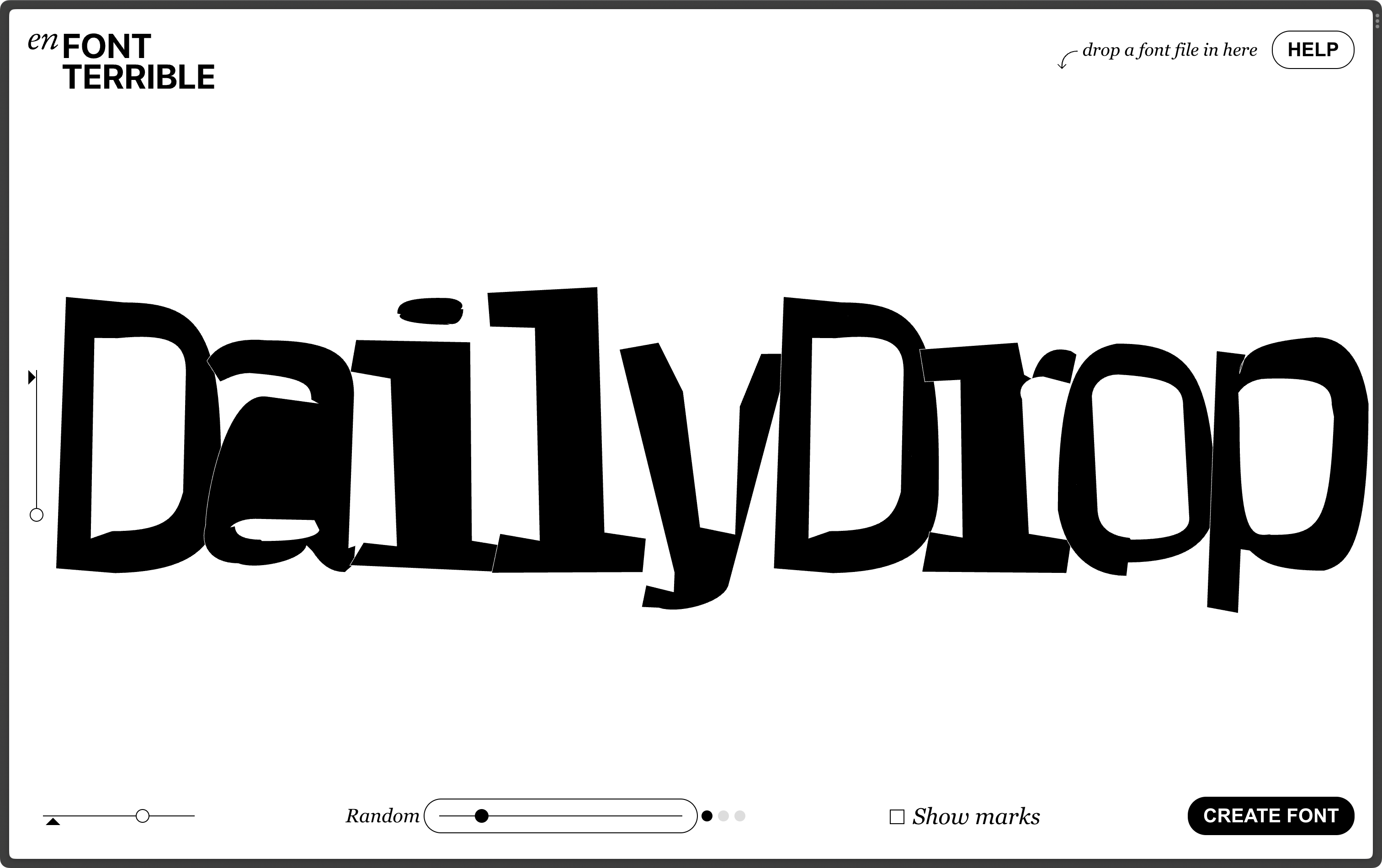
enFont Terrible is an international, award-winning weird type foundry based in the internet and founded by Javier Arce.
They create, publish, and distribute deform, break, and destroy high-quality retail and custom typefaces for analog and digital media fun.
Just drag and drop a font file on the site and move the sliders until you are happy with the result, then click Create font and a weird new font will be generated for you (which you can download and use).
All the Bézier mangling is done in-browser via JavaScript.
The section header is an example of what evil you can perform with this tool.
Netflix For Fonts

Dinamo is a Swiss type design agency offering retail and bespoke typefaces, design software, research, and consultancy. They make some incredibly cool typefaces which you can test-drive for free.
Their Dinamo Pipeline is a place to stream Dinamo’s variable fonts “Netflix style”. Yes, you read that right: stream fonts. They manipulate the variable font features in real time, and cycle through the font face, weight, and monospace settings, along with changing up the colors (you can just use theatre mode if quick color changes are problematic for you).
While I am not one to just leave a display on when not in deliberate use, I’d have no problem sitting and watching this play for some time.
The section header is a catch of one frame.
FIN
Whether you use ChatGPT or not, I think everyone should check out “GPT-4 Architecture, Infrastructure, Training Dataset, Costs, Vision, MoE”. Seeing all those “billions” in that piece truly bummed me out, today. ☮

Leave a comment