Tiff; Roughly Awesome; The Practice Of Type
The fan-fav topic is back, again, with one resource that will help you eyeball differences between fonts, stand out from other awesome crowds, and practically level up your typography skills.
Keeping with the theme of the week, they’re highly focused resources with just enough expository to (hopefully) get you to try out each one.
Tiff
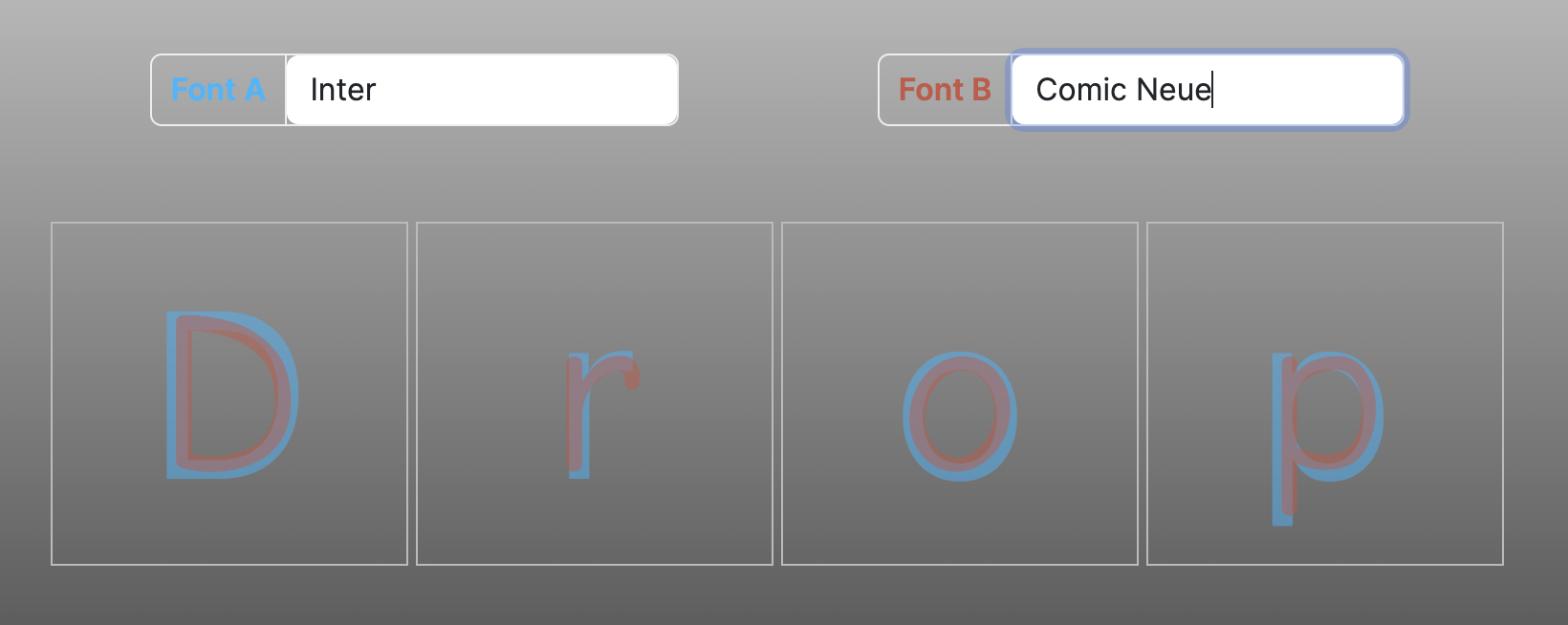
[T]ype d[iff] (GH) is a type diff tool that visually contrasts the differences between two fonts with four changeable glyphs.
Comparing individual glyphs between two typefaces by overlaying them on each other like this has some merit. The obvious (and, most important, IMO) one is being able to analyzing individual letter forms. While there are no “metrics” displayed, you can use your 👀 to analyze individual letter forms, x-height, and apertures. The overlay display lets you compare the shapes and proportions of individual glyphs and determine which typeface has more consistent letterforms.
The section header just about shows you how it works, and it presently only works with Google and system fonts. This could be a fun one to riff from for a weekend project (to help it support other font sources).
Roughly Awesome

Most folks do want to stand out from the crowd in some way, shape, or form.
Rough Font Awesome (GH) is a chimera1 built by combining Rough.js meets Font Awesome.
It’s more for creating SVG glyphs than building and using instead of FA-proper. As the section header shows, there are a fair number of configuration choices, along with the ability to preview results immediately, and copy the necessary SVG code.
The Practice Of Type

I’m just going to pilfer TPoT’s pitch whole cloth:
Whether you’re a novice or an expert in any medium, good decisions take practice — and great ones stand on a solid foundation. Typekit Practice is a collection of resources and a place to try things, hone your skills, and stay sharp. Everyone can practice typography.
Try using shades for eye-catching emphasis, browse useful references like advice about typographic hierarchy, or peruse our library of recommended books on typography and design. Sometimes it even helps to remind ourselves what typography is and why it’s valuable.
FAIR WARNING: This is an Adobe site, so use what you can to defend yourself from trackers and data theft (remember, this is the company who is stealing internal art department creations to train their own “AI” models across all their products). I “stole” their pitch since they stole/steal our stuff, like any capricious 12-year-old would!
Current lessons include:
Caring about OpenType features — In this lesson, they discuss what OpenType features are, when to use them, and why they matter.
Getting the most out of type specimens — In this lesson, they evaluate type specimens for web fonts — and turn those artful arrangements of glyphs, styles, and weights into design tools.
Selecting typefaces for body text — In this lesson, they review the essential traits of a good body text typeface: sturdy shapes, even color, and an active texture.
Using shades for eye-catching emphasis — In this lesson, they style expressive display type in a way that emulates different sign painting techniques.
Typography is how text looks — In this lesson, they consider what typography is and why it’s valuable.
FIN
I keep forgetting to mention that — in a couple weeks — I’ll be speaking in-person (S C A R Y) at the NY R Conference. I’ll be waxing poetic on WebR (ofc).
This is a combo event (in-person + virtual), and if you’d like to attend, I have some limited-use promo codes (just hit me up howev fits your mode). ☮
No State Alchemists were harmed in the making of this Drop.

Leave a comment