FontReach; GPU Text Rendering Techniques I & II; A Visual Masterclass Of Striking Typography
The Drop fan fav topic is back with some free stuff for you to grab, a technical deep-dive into modern font rendering techniques, and some typographical design inspiration for your next project.
FontReach

As we have discussed in many-a-Drop, picking a font for your next data visualization or design project — if you’re not boxed-in to an existing set of brand styles — can feel overwhelming at times. The sheer number of what I’ll call “font directories” — since most do little more than list font names and present a visual sample of the glyphs — is bonkers, and could take hours or days to sift through to find a gem in a field of plain rocks.
Enter FontReach, an encyclopedic font “database” that’s been around for a few years. I use the word “database” since it’s more than the aforementioned “directory”. It’s a curated selection of sans-serif, serif, script, handwritten, calligraphy, brush, movies, memes & many other font families that are all free for personal use. The entries authors are tagged as “Eduard Hoffmann” and “Susan Kare”. Those with an affinity for the history of typography and design will recognize those names. If not, I’d suggest poking around Multimediaman and Wikipedia to explore their significance.
At present, the site covers over 2,500 font families and each entry consists of:
a bit of lore about the font
a nod to the typeface designer
what is included (styles, glyphs, etc.) in the typeface family
a visual sample of it (the Tron font in the section header is an example of said sample)
license info (many are free for both personal and commercial use)
a download link
a list of alternative fonts
languages supported, and
a basic FAQ section
“Tidy Tuesday” and “30-day …” participants should find this to be a treasure trove of fonts to choose from to inspire and complement your already amazing themed creations.
GPU Text Rendering Techniques I & II
GPUs are (unsurprisingly) well suited for text rendering due to their parallel processing capabilities. In a two-part series (I, II) experts from Monotype take a deep dive into GPU text rendering techniques. These are a two-step process involving texture mapping and glyph rendering. Texture mapping involves mapping a texture onto a 3D object, while glyph rendering involves rendering individual characters or symbols. The article explains how these techniques have evolved over time and how they are used in modern graphics processing.
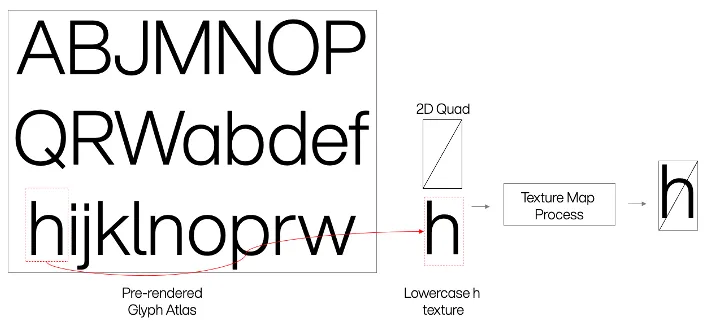
There’s a fancy term for this pre-rendering, dubbed creating a “glyph atlas”. David Stern, a highly talented developer on the Warp browser team, has a great, complementary write-up on GPU rendering and explains what a “glyph atlas” is super well:
A glyph atlas is a GPU texture (image) which contains all of the rasterized bitmaps for the glyphs we need to show the user. Instead of performing the vector → bitmap conversion every time we redraw the application, we store the result in a texture and then ask the GPU to “copy” the bitmap from the atlas texture to the correct location in the output buffer (the texture where we’re rendering the window contents). We combine font ID, glyph ID, and font size to form our cache key, ensuring that any “scaling” is performed by the rasterizer, which would produce much crisper results (when scaling up) than nearest-neighbor or bilinear scaling on the GPU. When an atlas texture fills up with glyphs, we create another one; at rendering time, we tell the GPU which texture holds the glyph in question and where in the texture the glyph is located.
The section header is an example glpyh atlas ripped brazenly from the Monotype post.
All three linked articles are filled with crunchy technical GPU and typography goodness that will provide real insight into how modern text rendering techniques work.
A Visual Masterclass Of Striking Typography

As anyone who has checked in on things I create, when it comes to “design” work, I’m more of a “riffer” than an outright “creator”. I think that’s due to [lack of] patience more than anything else; but, it’s also partly due to just being awed by what others create. I tap many places for riffing inspiration, and one of the places I check in regularly with is Orpetron Web Design Awards. They’re a collective of designers who help shed a spotlight on other designers. I mainly RSS their Medium (sigh) blog, and a recent-ish entry features 10 Websites With A Visual Masterclass Of Striking Typography.
Each entry takes you to the Orpetron site-proper where there are a number of examples of the designs featured, a set of calculated usability, design, and development metrics from the Orpetron team members.
I think my favorite entry from this list is the Wind Engineering Institute (株式会社風工学研究所 direct link) since it’s so different — both in terms of overall presentation and Asian glyph-centric typography design. What those folks do for a living is also pretty spiffy.
If you, too, are also a “riffer”, the Orpetron site, blog, and this particular entry should help you on your typographic design journey.
FIN
I hope everyone has a fontastic day! ☮

Leave a comment