Disheveled Trends; Malignant Maps; Incidental AI: Just One More Thing
These Drops are usually positive, but not everything out there is all shiny and happy. Every so often, we really should focus on the horrible, so we can fully appreciate the awesome. And, today’s Drop is, indeed, full of quite horrible things.
Disheveled Trends

Chances are, if you’re even just an occasional member of the data tribe, you’ve used Google Trends (“gTrends”) in a non-casual way at least once.
What do I mean by “non-casual”?
Well, it’s one thing to just poke at gTrends so satisfy a personal curiosity. It’s quite another to, say, use it to make a point in a paper, presentation, blog post, or article. Furthermore, it’s far from casual to use it in an experimental setting (you do remember the Flu Trends fiasco, right?) or to make business decisions.
In “Big data, big problems: Why scientists should refrain from using Google Trends”, Alexandra Franzén, a postdoc researcher at Halmstad University’s School of Health and Welfare, makes a pretty solid case against using Google Trends for, well, anything. This isn’t one of those arXiv preprints designed to make one or more authors internet-famous for a day/week. It was published in the open access journal “Acta Sociologica” this week, and pulls no punches in the abstract:
Google Trends has for over a decade been used by researchers in medicine and the social sciences who want to use information about internet searches to gain new data and insights concerning medical and social issues. A similar tool by the same company, Google Flu Trends, was abolished by Google in 2015 due to serious problems with accuracy; raising larger questions about the quality of the data provided, not only by Google, but by all platforms collecting big data. In this article, I use an unplanned experiment to test the reliability and replicability of Google Trends. The results strongly indicate that scientists in all fields should refrain from using the tool Google Trends when conducting research.
As the author notes, “Google Trends has gained ground as an important analytic tool for researchers in medicine and social science who want to use the data emanated from Google searches to investigate medical or social aspects of modern-day society”.
And, gTrends has been used in some very real research projects:
predicting mobilization of members of the Tea Party movement on a state level in the United States
investigating the possible connection between Google searches for high status products and income inequality
examining if Barack Obama lost votes in the American presidential elections in 2008 and 2012 due to racial animus
poking at the level of interest of Puerto Ricans in moving to the American mainland
predicting short-term events in the economy
producing a new method to measure religious beliefs at the national level
investigating how media events such as political debates and gaffes made by politicians influence British and American voters’ Google search queries during election campaigns.
And, those are just the ones in Alexandra’s field of study.
The author then walks us through a series of unplanned, failed attempts at replicating a data set being used in another paper she was writing, and includes some fairly damning third-party science-based criticisms of gTrends in the last two paragraphs. These are summed up nicely in another paper: “The Parable of Google Flu: Traps in Big Data Analysis”.
Perhaps this is the year we stop blindly trusting products and services from opaque global, multinational organizations?
Malignant Maps
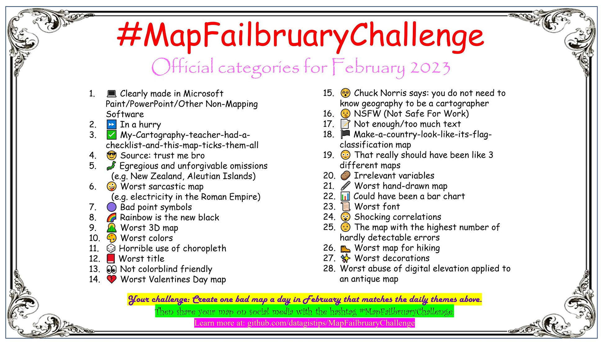
The goal of the annual #30DayMapChallenge is to give folks prompts, so they can make some pretty remarkable creations.
The goal of #MapFailbruaryChallenge is the polar opposite, and encourages folks to “create the worst map possible.”
Along with the hashtag and GitHub space, there’s now an official website, meaning you have no excuse to avoid ocular harm.
I’m glad they picked the shortest month of the year, since I’m uncertain if I could stand 31 days of terrible maps.
NB: I shall most certainly not be participating in this caustic adventure, and I beseech the Great Maker to inspire all participants to make good use of Mastodon’s “CW” and “sensitive media” features for all entries.
They do get bonus points for making the challenge’s category reference hard to look at for any length of time.
Incidental AI: Just One More Thing

This is a follow-up to the “Incidental AI” issue.
On January 31st, OpenAI released a fairly terrible “AI classifier for indicating AI-written text”. Why is it “fairly terrible”? See for yourself:
Our classifier is not fully reliable. In our evaluations on a “challenge set” of English texts, our classifier correctly identifies 26% of AI-written text (true positives) as “likely AI-written,” while incorrectly labeling human-written text as AI-written 9% of the time (false positives). Our classifier’s reliability typically improves as the length of the input text increases. Compared to our previously released classifier, this new classifier is significantly more reliable on text from more recent AI systems.
(You should absolutely read their full post, especially the “Limitations” section.)
With a 26% success rate and a known 9% false positive rate, this tool is going to do quite a bit of harm. I hope some AI watchdog groups or a few academics design some experiments to see if said harms are directed at marginalized and underrepresented humans. I mean, that is the repeatedly demonstrated main maneuver in the playbook of the get-rich-quick segment of the AI crowd.
FIN
On review, this issue was just not horrible enough, so I’ll leave you with some stories that truly Excel at horror. ☮

Leave a comment